
Your website may look fine at first glance, but small problems can quietly push potential customers away. Slow pages, confusing navigation, unclear messaging, and difficult contact processes can all create friction between a visitor and the action you want them to take.
For a small business, that matters because your website is often one of the first places people interact with your brand. A visitor might arrive after finding you on Google, seeing an ad, or hearing about your business from someone else, and the experience they have on your site can influence whether they contact you or keep looking.
The good news is that many common website mistakes are fixable. Understanding where your website creates friction is the first step toward making it easier for visitors to trust your business and become customers.
Why Small Website Problems Can Have a Big Impact
Most visitors do not analyze a website the way its owner does. They simply want to understand what you offer, decide whether they trust you, and figure out what to do next. Stanford’s web credibility research has found that design, usability, useful information, and even seemingly small errors can influence how credible people perceive a website to be. When several problems appear together, a potential customer has more reasons to leave rather than continue exploring.
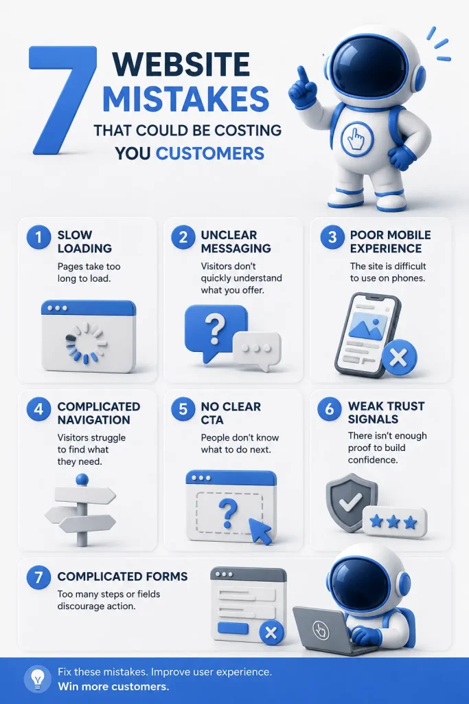
1. Your Website Loads Too Slowly
A visually impressive website does not help much if visitors become frustrated waiting for it to load. Large images, unnecessary scripts, poorly optimized code, excessive plugins, and weak hosting can all contribute to slower performance. Speed problems can be especially noticeable for visitors using mobile devices or slower connections. Google also recommends good Core Web Vitals as part of providing a strong overall page experience.
How to Spot the Problem
Do not judge your website only from the computer and internet connection you use every day. Test important pages across different devices, particularly your homepage, service pages, landing pages, and contact page.
Tools such as Google PageSpeed Insights can help identify technical performance problems. Pay attention to large images, unnecessary third-party scripts, layout shifts, and elements that take too long to become usable.
How to Improve It
Start with the biggest performance problems rather than trying to achieve a perfect technical score. Compress oversized images, remove unnecessary plugins and scripts, enable caching where appropriate, and make sure your hosting can comfortably handle your website.
A faster website reduces unnecessary friction. Visitors should be thinking about your business, not about how long your page is taking to appear.
2. Visitors Cannot Quickly Understand What You Do
One of the most common website mistakes is assuming visitors already understand the business. A homepage might use a clever headline such as “Building Better Possibilities” without explaining what the company actually sells, who it helps, or where it operates.
Your visitors should not have to investigate your website to understand its purpose. If the main message is vague, they may leave before discovering that your business offers exactly what they need.
Make Your Value Clear
Look at the first section of your homepage and ask three questions:
- What does this business offer?
- Who is it for?
- What should I do next?
A local accounting company, for example, could say, “Bookkeeping and Tax Services for Small Businesses in [City]” instead of relying on an abstract slogan.
You can still have personality in your copy. Clarity simply needs to come first.
3. Your Website Is Difficult to Use on Mobile
A website that works well on a laptop can still be frustrating on a phone. Tiny text, buttons that are difficult to tap, menus that do not work properly, oversized images, and content extending beyond the screen are all signs of poor mobile usability.
Mobile usability is also part of the broader page experience Google encourages site owners to evaluate. Google recommends that content display well on mobile devices rather than forcing users to struggle with the page.
Test the Actual Experience
Open your website on your phone and try to use it as though you were a new customer.
Can you navigate the menu easily? Can you read everything without zooming? Are buttons easy to tap? Can you complete a form without fighting with the screen?
Do not stop at the homepage. Test service pages, contact forms, booking tools, product pages, and other important parts of the customer journey.
Responsive web design should make those experiences comfortable across different screen sizes.
4. Your Navigation Is Too Complicated
Your navigation exists to help people find information, not to display every page your website contains. Long menus, unclear page names, too many dropdowns, and inconsistent navigation can make a relatively simple website feel complicated.
When visitors have to guess where information is located, you are asking them to do unnecessary work. Stanford’s credibility guidelines specifically identify ease of use and usefulness as factors that can strengthen website credibility.
Keep Important Choices Obvious
For many small business websites, the main navigation can stay relatively simple:
- Home
- About
- Services
- Work or Case Studies
- Resources
- Contact
The exact structure depends on the business, but the principle stays the same. Put the pages potential customers need most within easy reach.
Also use descriptive labels. “Commercial Cleaning Services” tells visitors more than a vague menu item such as “Solutions.”
5. There Is No Clear Call to Action
Imagine a potential customer reads your homepage, checks your services, likes what they see, and decides they are interested.
What happens next?
If the answer is not immediately obvious, the website may be losing opportunities. Even a website that gets plenty of traffic can struggle to generate customers when visitors are unsure what to do next. A call to action, or CTA, tells visitors what they can do when they are ready to move forward.
Give Visitors a Logical Next Step
The right CTA depends on your business. Examples include:
- Request a Quote
- Schedule a Consultation
- Book an Appointment
- View Our Services
- Contact Our Team
- Start Your Free Trial
Avoid overwhelming visitors with several competing actions in the same area. Decide which action matters most and make it visually easy to find.
You can also place calls to action at natural points throughout longer pages. A visitor should not have to scroll all the way back to the top just to figure out how to contact you.
6. Your Website Does Not Build Enough Trust
A visitor who has never worked with your company is making a series of small judgments while browsing your website. They may wonder whether your business is legitimate, whether you have experience, whether others have had good results, and whether contacting you is worth their time.
Professional design contributes to that perception, but trust is not created through appearance alone. Stanford’s research-based credibility guidelines recommend making information verifiable, showing that a real organization exists behind the website, presenting professional design, keeping information current, and avoiding errors such as broken links.
Add Real Trust Signals
Depending on your business, useful trust signals could include:
- Customer testimonials
- Reviews
- Case studies
- Client logos
- Certifications or professional memberships
- Team information
- Business contact details
- Real project examples
- Clear policies and guarantees
Specificity matters. A detailed testimonial explaining the customer’s problem and experience usually tells visitors more than a generic statement such as “Great company!”
Trust signals should support your claims rather than replace them.
7. Your Forms or Checkout Process Create Too Much Friction
Getting someone interested is only part of the job. Your website also needs to make the final action easy.
A contact form asking for 12 pieces of information when you only need a name, email, and short message creates unnecessary effort. Ecommerce websites can have the same problem with lengthy checkout processes, forced account creation, confusing forms, or unexpected steps.
Baymard Institute’s ecommerce research found that 17% of surveyed US online shoppers had abandoned an order in the previous quarter because checkout was too long or complicated. Its research also shows that checkout usability problems can often be addressed through design changes.
Ask Only for What You Need
Review every field in your contact, quote, booking, or checkout forms.
Ask yourself, “Do we actually need this information before speaking with this person?”
If not, consider removing the field or collecting the information later.
The goal is not always to make a form as short as physically possible. A contractor may genuinely need project details before preparing a quote, for example. The goal is to remove unnecessary friction while collecting enough information to take the next step.
How to Tell Which Website Mistakes Matter Most
Finding several problems does not mean you need to rebuild your entire website immediately. Start by looking at the pages that matter most to your customer journey, then identify where visitors appear to struggle or leave. Analytics, conversion tracking, form submissions, customer feedback, and simple usability testing can help you separate assumptions from actual problems. Prioritize issues that directly affect whether someone can understand your offer, trust your business, or complete an important action.
Start With Your Highest-Value Pages
Review your homepage, main service pages, high-traffic landing pages, contact page, and checkout or booking flow first.
For each page, ask:
- Is it immediately clear what this page is about?
- Does it work comfortably on mobile?
- Does it load reasonably quickly?
- Is the information easy to scan?
- Does it answer the visitor’s likely questions?
- Is there a clear next step?
- Does anything make the business feel less trustworthy?
You may discover that a few targeted improvements solve more problems than a complete visual redesign.
A Better Website Removes Friction From the Customer Journey
Good web design is not simply about making a website look modern. It is about helping visitors move from curiosity to understanding, from understanding to trust, and from trust to action. A confusing menu, slow page, vague headline, or complicated form might seem minor on its own, but each creates another opportunity for a potential customer to leave. Fixing these common website mistakes can make the experience clearer and easier without necessarily rebuilding everything from scratch.
Ready to Improve Your Business Website?
If your website is difficult to use, outdated, slow, or simply not generating the inquiries you expected, it may be worth looking at the experience from your customers’ perspective.
Click Catalyst helps businesses build websites designed around clear messaging, usability, performance, and business goals. Explore our web development services to see how we can help turn your website into a stronger part of your marketing strategy.
Key Takeaways
- Slow website performance can create unnecessary friction for potential customers.
- Visitors should quickly understand what your business offers and who it serves.
- Your website needs to provide a comfortable experience on mobile devices.
- Simple navigation makes important information easier to find.
- Every important page should give visitors a clear next step.
- Testimonials, case studies, business information, and other trust signals can strengthen credibility.
- Contact forms, booking processes, and checkouts should ask only for information that is genuinely necessary.
- You do not always need a complete redesign. Fixing high-impact usability problems can be a practical place to start.